Asurion Home+ Purple Door Campaign

The purple door symbolizes both Asurion’s core brand identity and the gateway to a fully protected, worry-free home. Its vibrant color draws immediate attention, creating an inviting entry point for customers.

Purple Door Email & Brochure

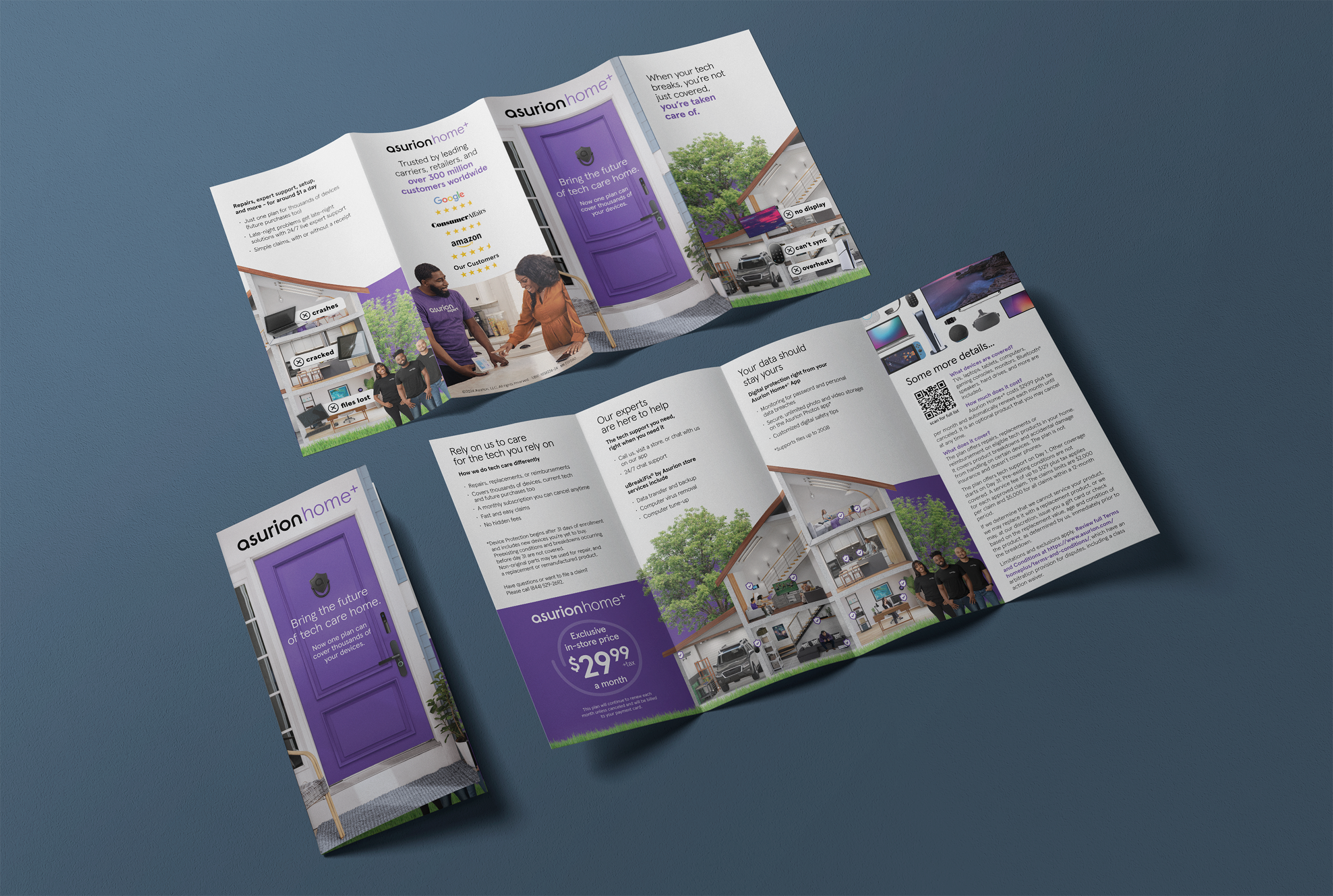
The gatefold begins with a glimpse of a home in tech disarray—broken screens, syncing issues, and overheating devices. But as the gatefold opens fully, the scene shifts to reveal a transformed home where every device functions perfectly. The email delivers the same experience in a scrollable format.

Tech Disarray

This “before” image underscores the importance of Asurion Home+ by illustrating the frustrations of malfunctioning tech.

Tech Harmony

The scene highlights the Home+ promise of hassle-free tech support, so families can relax and enjoy their spaces. It’s not just about tech, it’s about the home.

Legal You Can Read

It’s legal that doesn’t read like “legalese.” By using a thoughtful type hierarchy, strategic color choices, and varied font weights, the design makes complex information more easily digestible.